
Whether it's answering questions, providing support, or helping users through different tasks, chatbots make interactions faster and easier. But it's not just about how smart the chatbot is—the way it looks and feels to the user is just as important.
A good chatbot design can make a huge difference in whether users enjoy using it or not. Just like any part of your website, the chatbot’s user interface (UI) needs to be easy to use, visually appealing, and match the style of your brand.
In this article, we’ll look at 10 chatbot UI design examples that you can use to create your website chatbot. Whether you need a simple button to launch your chatbot, a full chat interface, or a dashboard to manage chatbot settings, these examples will help you get started.
Website Chatbots UI Components
Here are the top components that are specific to website chatbots.
- Chat Window/Interface (Widget) - the main area where users can see and send messages.
- Quick Reply Buttons - default options or buttons that help users to respond quickly without typing, often used for common queries or decision-making steps.
- Typing Indicator - a visual cue that shows the chatbot is "thinking" or preparing a response.
- Carousel Cards - a component that displays multiple cards in a horizontal scroll format, useful for showcasing products or providing multiple options.
- Persistent Menu - a menu that remains visible at the bottom of the chat window, allowing users to easily navigate through options like "Help," "Settings," or "Restart."
- File Upload/Attachment Button - a button allowing users to upload files or images directly within the chatbot interface. This is useful for support bots where users may need to share screenshots or documents.
- Error Handling Messages - specific messages or prompts that appear when the chatbot doesn’t understand a request, often offering alternative solutions or guiding users back on track.
Chatbot UI Design Principles
Here are the top components that are specific to website chatbots.
1. Be Consistent
Use the same fonts, colors, and buttons throughout the chatbot. The user experience should feel familiar at all times.
2. Clear Communication
Make sure the chatbot explains what it can do. Keep the language simple and easy to understand.
3. Guide the User
Offer suggestions or buttons so users know what to do next. Help them avoid dead ends.
4. Handle Errors Well
When the chatbot doesn’t understand, offer helpful error messages and guide users back on track.
5. Provide Feedback
Let users know when a message is sent or when the chatbot is thinking, so they’re not left waiting.
Read this Website Chatbot Design Tips article to learn more how you can create your chatbot easily.
Website Chatbot UI Design Examples
1. View Chatbot Button
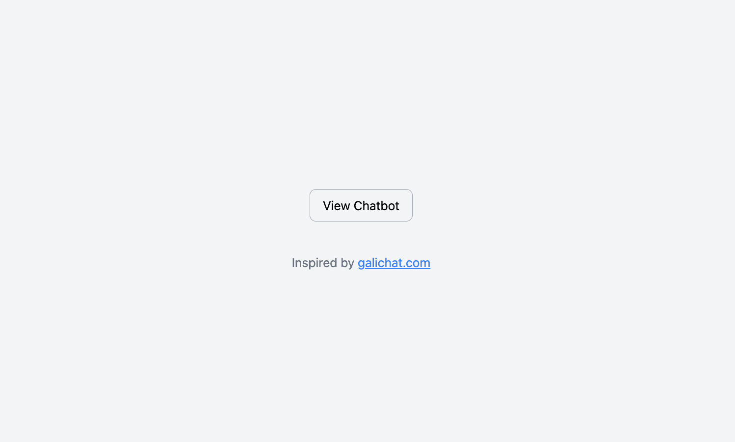
This UI chatbot component features a simple, centered button labeled "View Chatbot" within a clean and spacious card layout. The button is minimalist, with rounded edges and a soft background, creating an intuitive and modern design that invites interaction. It is ideal for directing users to view or launch the chatbot interface.
➡️ Get the source code for free.
2. Chatbot Radio Buttons
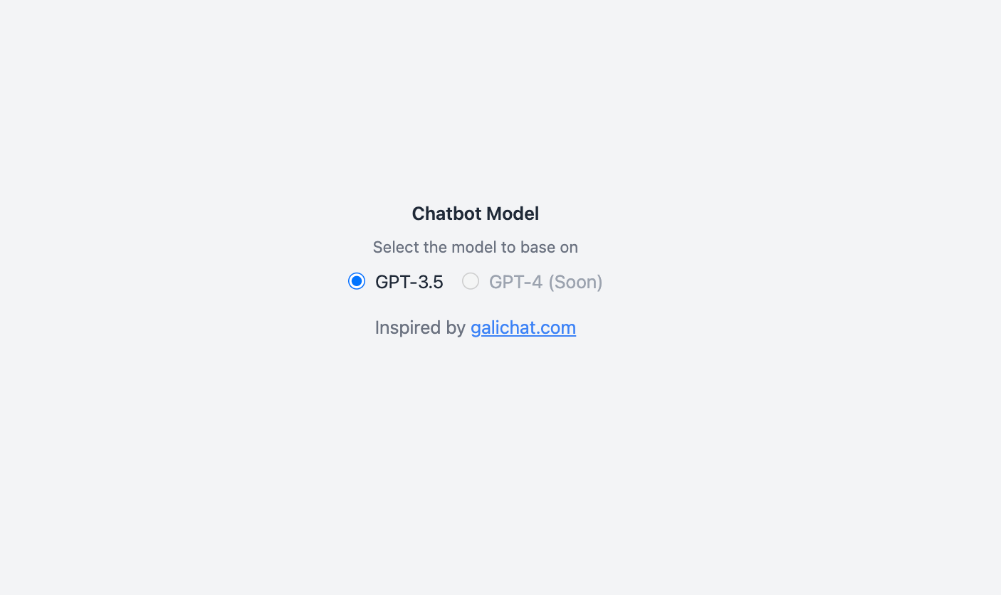
This UI component provides a clear and organized selection of chatbot models through radio buttons. Users can choose between "GPT-3.5" and the upcoming "GPT-4 (Soon)" option, which is disabled to indicate future availability. The interface is centered and designed with a user-friendly, clean look, making it easy for users to make a selection with clarity and focus.
➡️ Get the source code for free.
3. Create Chatbot Card
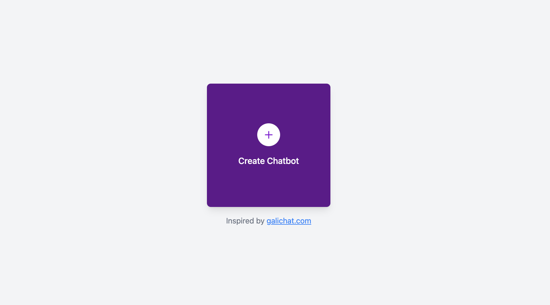
This component is a visually engaging card that features a prominent plus icon, inviting users to "Create Chatbot." The card has a rich, gradient background with a smooth, modern aesthetic. Its rounded corners and sleek design make it both functional and attractive, offering a visually appealing call-to-action for creating a chatbot.
➡️ Get the source code for free.
4. Chatbot Toggle Buttons
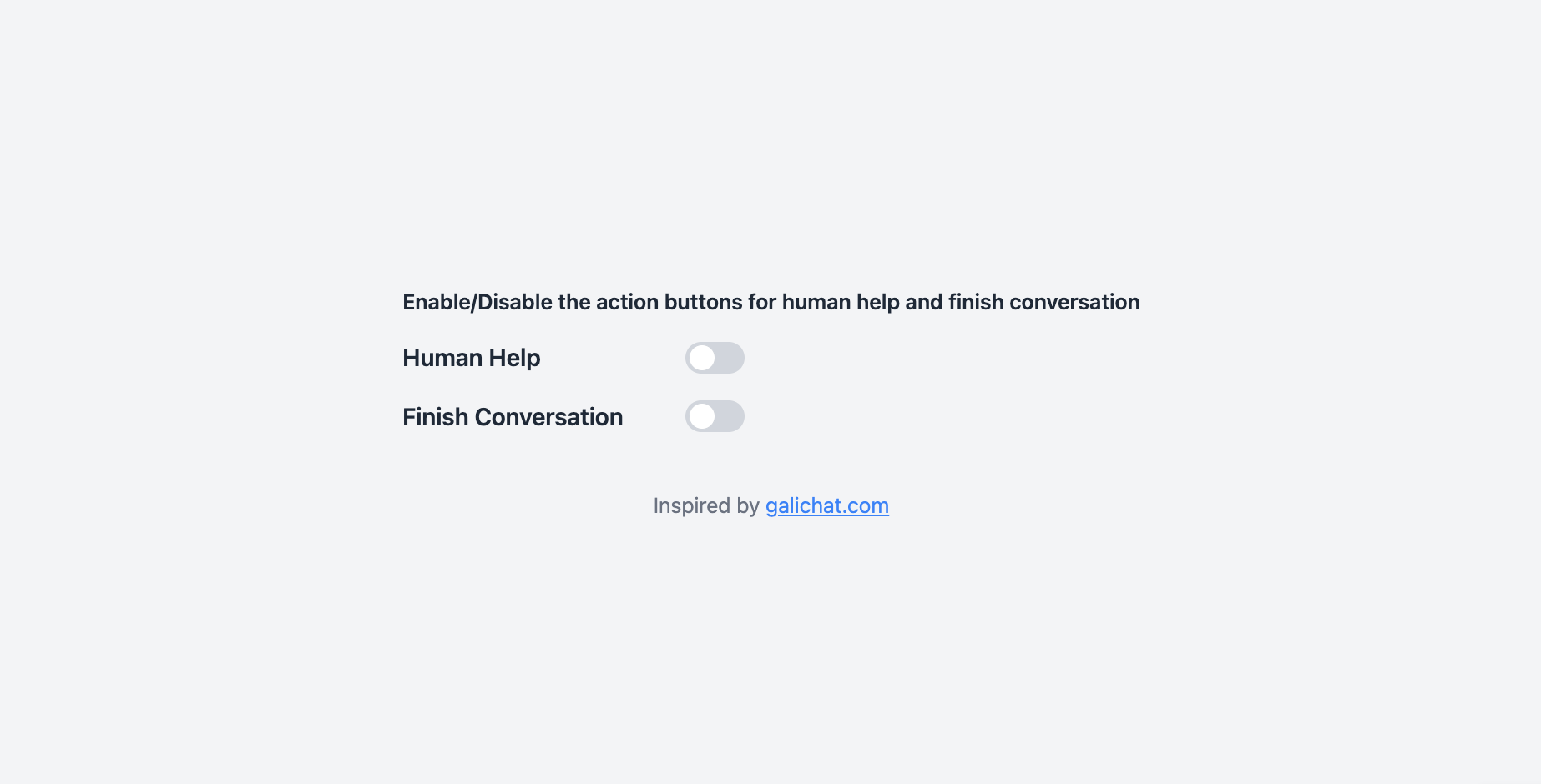
This component includes two toggle switches that allow users to enable or disable specific chatbot functions, such as "Human Help" and "Finish Conversation." Each toggle is styled with a modern, smooth animation and clear labels, making it easy to control functionality. The layout is centered and minimal, ensuring the interface remains clean and accessible for users.
➡️ Get the source code for free.
5. Chatbot Stats Cards
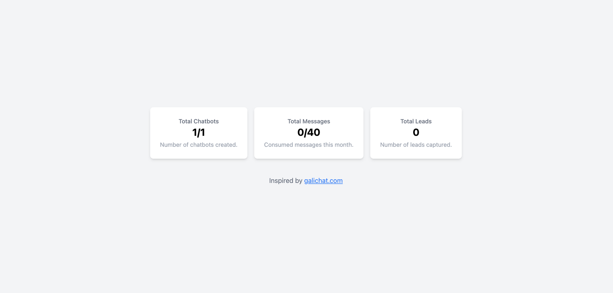
This component presents a set of three stat cards, each providing key information such as "Total Chats", "Resolved Issues", and "Active Sessions". The cards are cleanly designed, with clear headings and numerical data, making it easy for users to quickly assess chatbot performance metrics. The layout is minimal, visually structured, and ideal for dashboard displays.
➡️ Get the source code for free.
6. Chat Skeleton
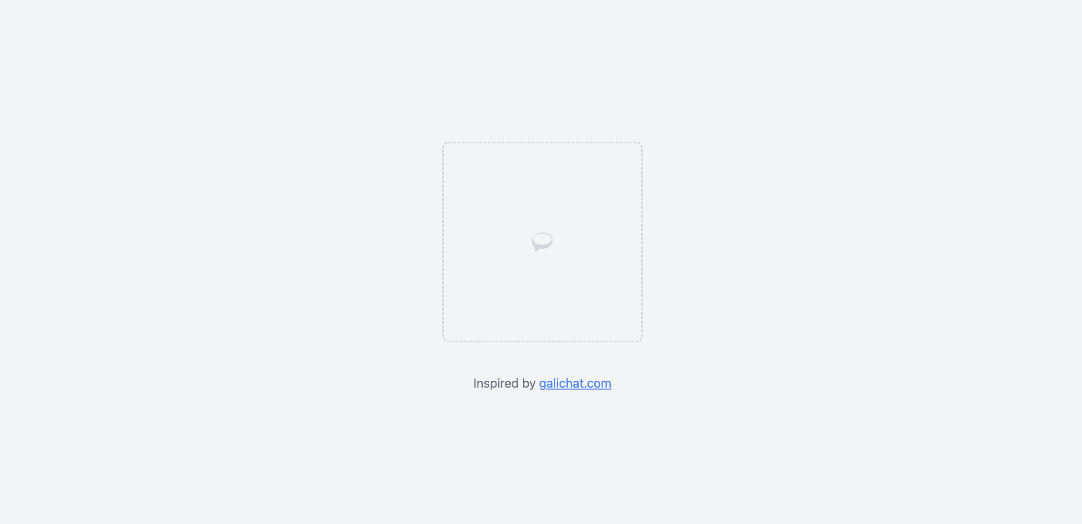
This component provides a placeholder or "skeleton" layout, useful during the loading of chat elements. It includes a simple dashed border representing the eventual chat interface or message display. The minimalist design offers a glimpse of the structure without overwhelming users, serving as a smooth transition while content loads.
➡️ Get the source code for free.
7. Chatbot Admin Sidebar
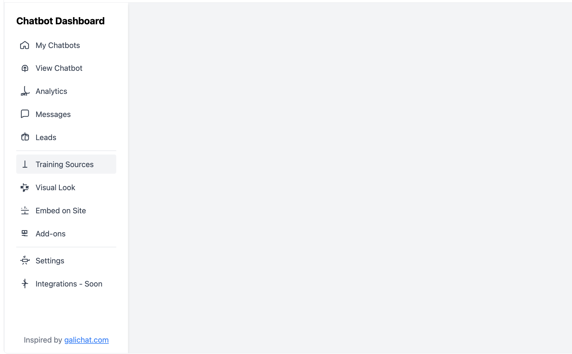
This component is a functional sidebar designed for chatbot administration. It features a clear vertical navigation menu with sections like "My Chatbots", "Analytics", "Messages", and more. The sidebar offers a well-organized structure, allowing users to easily navigate between different chatbot management tasks. It is a great addition for admins who need to manage various chatbot settings.
➡️ Get the source code for free.
8. Chatbot Add-on Card
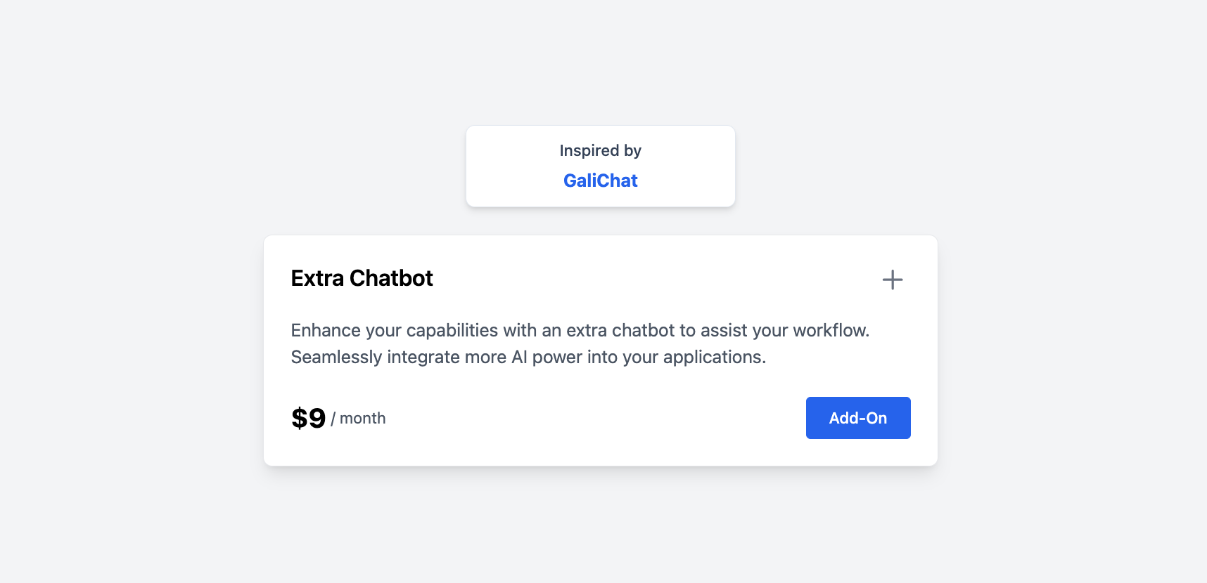
This UI component highlights an additional feature or service that can be purchased as an add-on to enhance chatbot capabilities. The card has a concise description of the extra service, a price tag, and a prominent "Add-On" button for quick access. The modern, structured layout makes it easy for users to understand and purchase the extra chatbot features.
➡️ Get the source code for free.
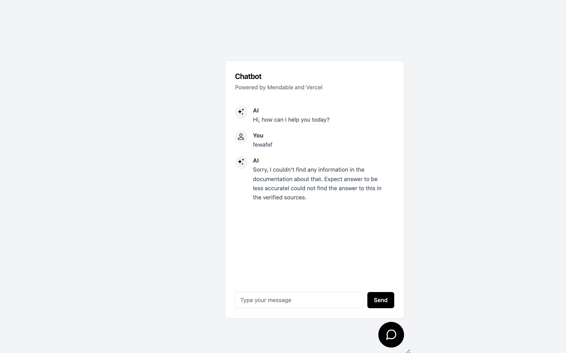
9. Chat Interface
This UI component provides a user-friendly chat interface where users can communicate with the chatbot. It features a clean, simple design with a conversation window, showing messages from both the user and the chatbot. The input field is easy to navigate, allowing users to type their messages and interact seamlessly. This layout mimics a typical chat experience, making it intuitive and familiar for users.
➡️ Get the source code for free.
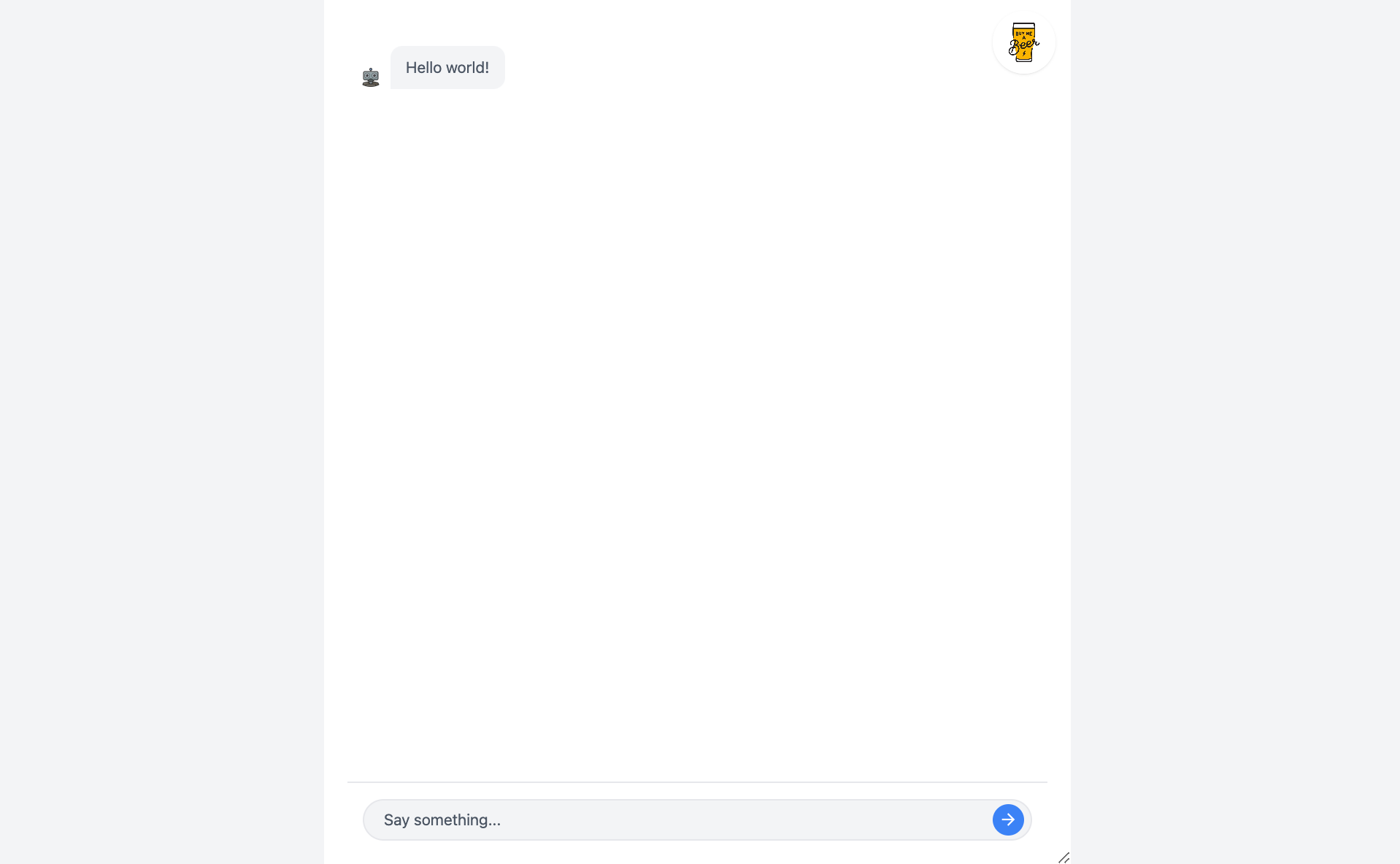
10. Chatbot Widget
This component is a compact chatbot widget that can be embedded on websites or applications. It offers a simplified interface with a greeting and a few pre-set options to guide users through common queries. Users can also type their own messages in the provided text box. The widget is minimal yet functional, perfect for adding quick chatbot support to any page without overwhelming the user experience.
➡️ Get the source code for free.